Charts
The default chart type is a line chart, which automatically generates from a timeseries. If you need to create other chart types, such as a pie or coumn bar, use a map and the associated chart transformation. Continue reading for more details on the chart types available in Rose.
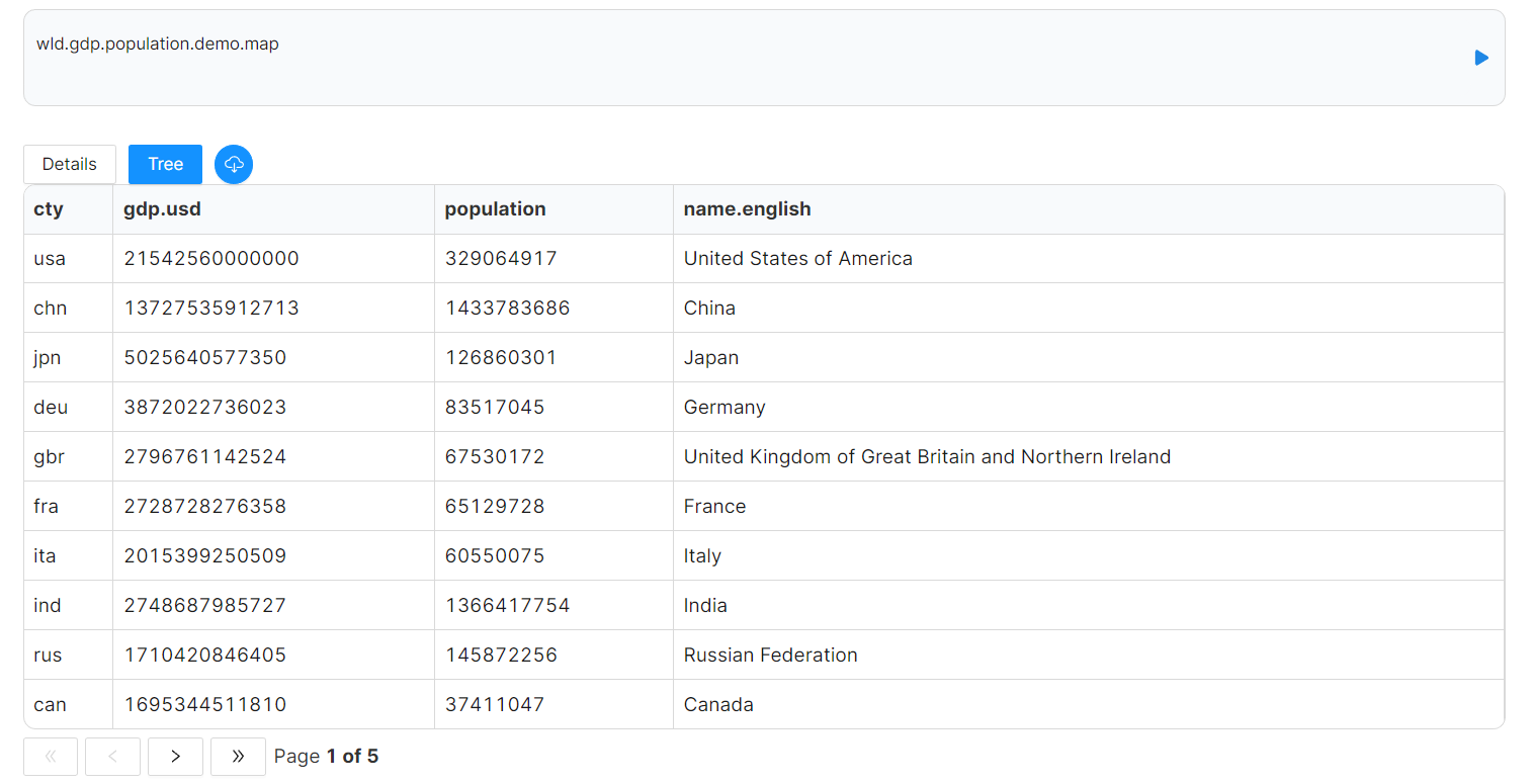
We will use the following map as a demo for most of the chart types. This map contains gdp and population data of selected countries in the world: wld.gdp.population.demo.map and will also be applying transformations to our map to get it into the best format for charting.
For all chart types, the fields for labels and values will be column names from the map.
For additional technical specifications, see Transformations - Charting.
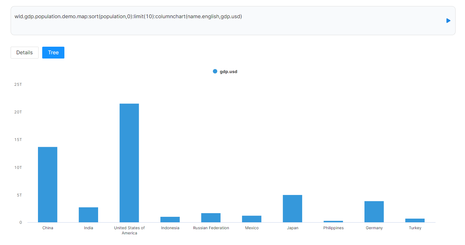
Column Chart
:columnchart(labels, values)
To make a column chart, provide a column of labels for X-axis and a column of values for Y-axis. In this case, we use column name.english for labels and gdp.usd for values.
wld.gdp.population.demo.map:sort(population,0):limit(10):columnchart(name.english,gdp.usd)
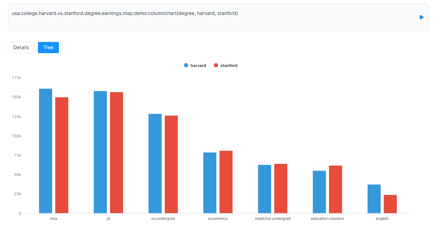
Column Chart with Multiple Categories of Data
:columnchart(labels, values of group 1, values of goup 2, ...)
usa.college.harvard.vs.stanford.degree.earnings.map.demo:columnchart(degree, harvard, stanford)
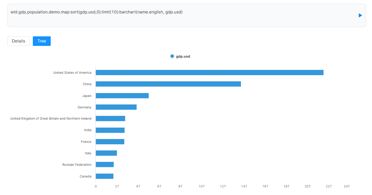
Bar Chart
:barchart(labels, values)
To make a bar chart, provide a column of labels for X-axis and a column of values for Y-axis. In this case, we use column name.english for labels and gdp.usd for values
wld.gdp.population.demo.map:sort(gdp.usd,0):limit(10):barchart(name.english, gdp.usd)
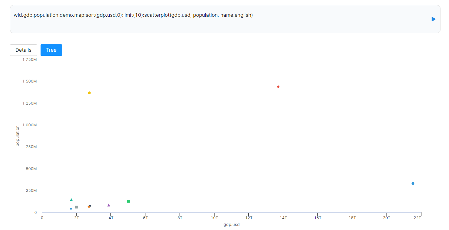
Scatter Plot
:scatterplot(x-axis, y-axis, labels)
To make a scatter chart, provide a column of values for X-axis, a column of values for Y-axis, and a column of labels. In this case, we use column gdp.usd for X-axis, population for Y-axis, and name.english for labels.
wld.gdp.population.demo.map:sort(gdp.usd,0):limit(10):scatterplot(gdp.usd, population, name.english)
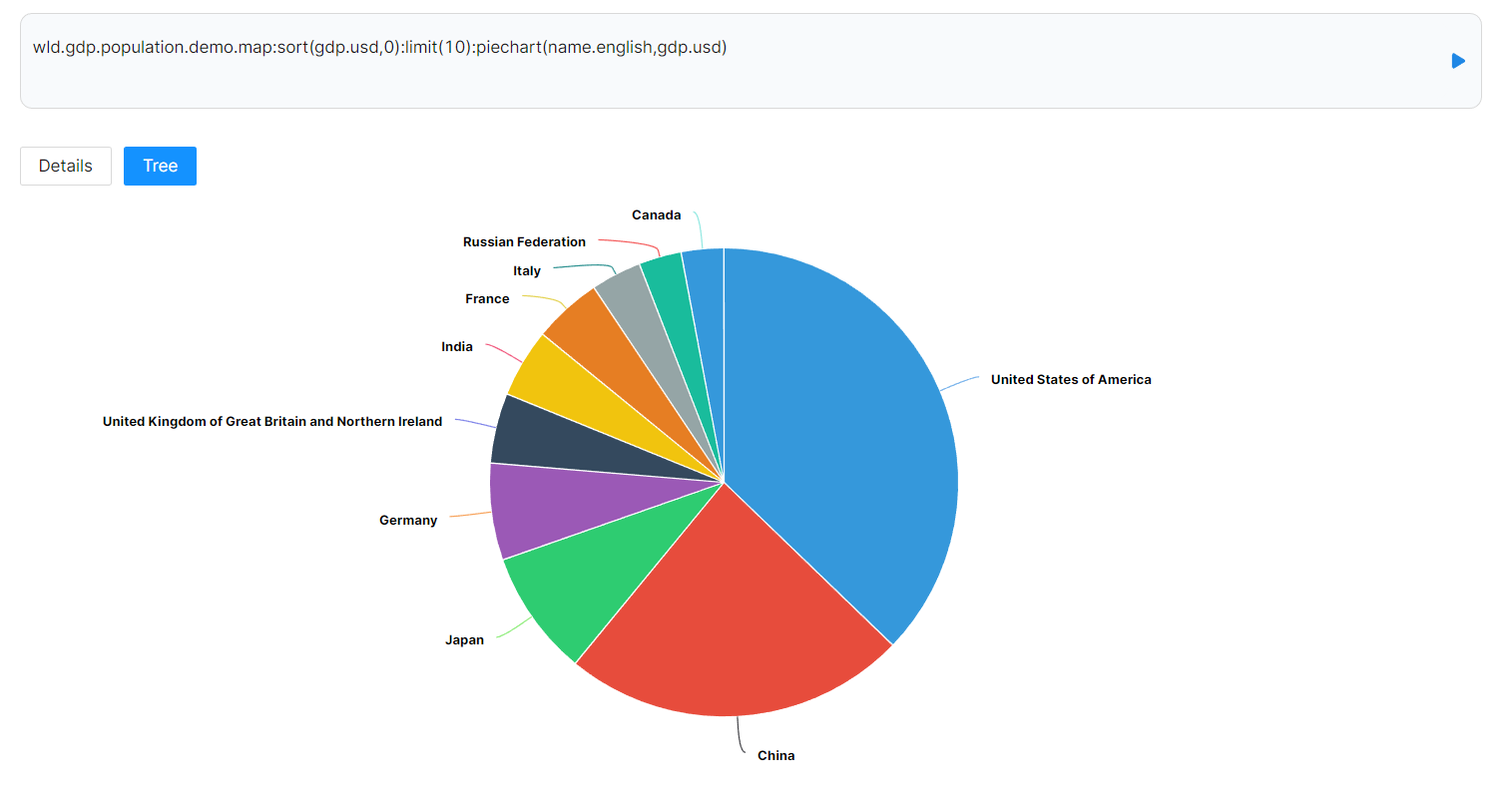
Pie chart
:piechart(labels, values)
To make a pie chart, provide a column of labels and a column of values. In this case, we use column name.english for labels and gdp.usd for values
wld.gdp.population.demo.map:sort(gdp.usd,0):limit(10):piechart(name.english,gdp.usd)
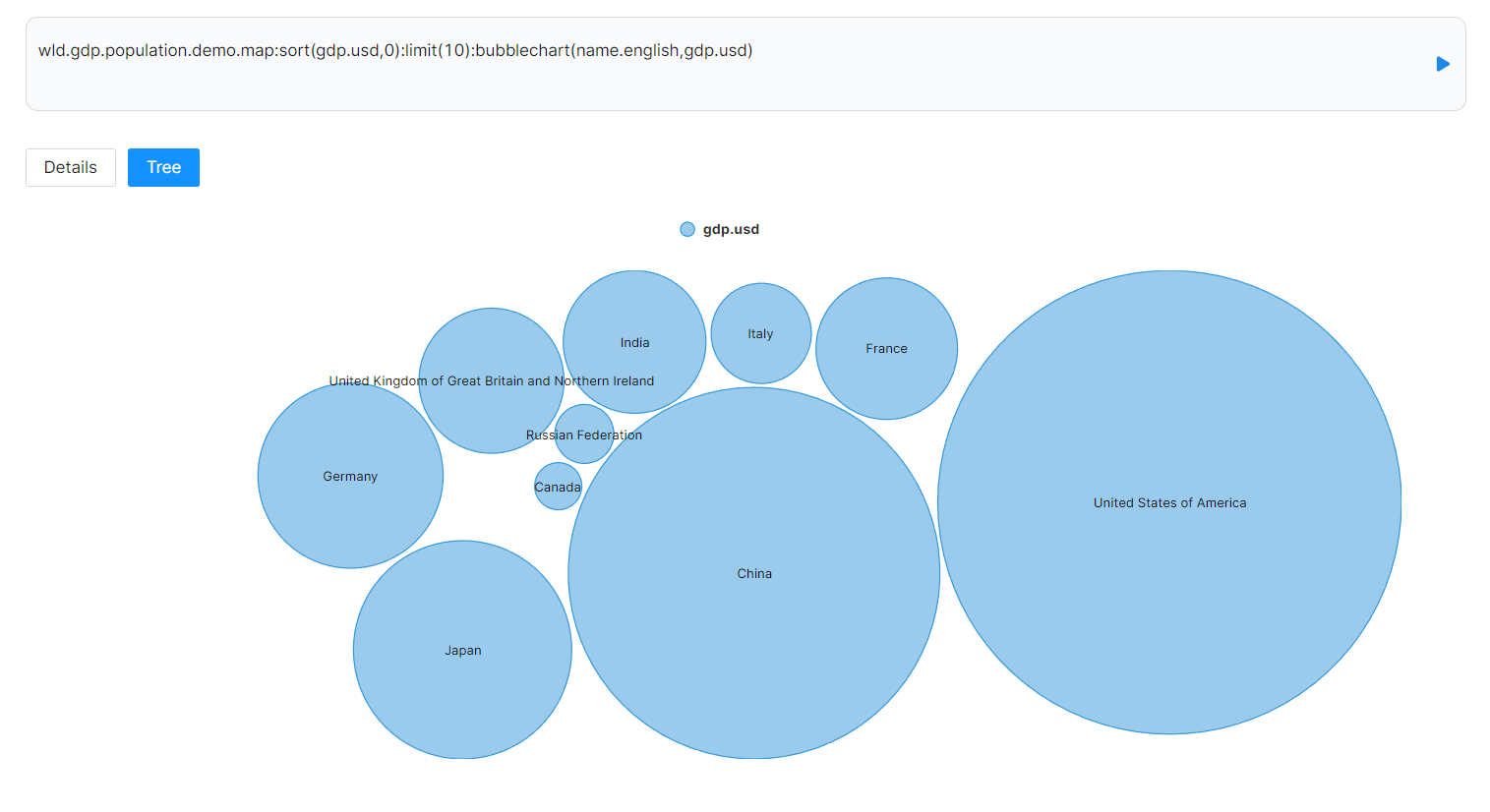
Bubble Chart
:bubblechart(labels, values)
To make a bubble chart, provide a column of labels and a column of values. In this case, we use column name.english for labels and gdp.usd for values
wld.gdp.population.demo.map:sort(gdp.usd,0):limit(10):bubblechart(name.english,gdp.usd)
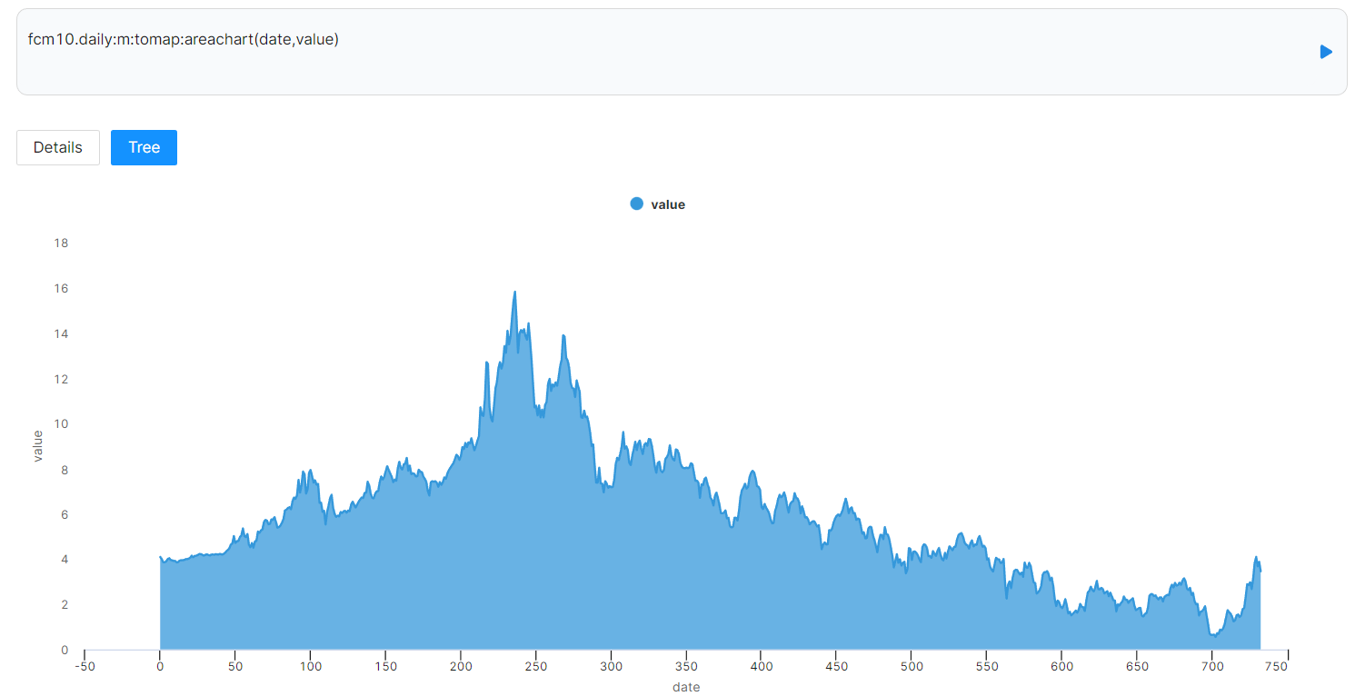
Area Chart
:areachart(x-axis, y-axis, labels, values)
To make a scatter chart, provide a column of values for X-axis, a column of values for Y-axis, and a column of labels.
`
fcm10.daily:m:tomap:areachart(date,value)